Matplotlib (Pyplot) 常用程式碼範例
這裡介紹一些常用的程式碼和圖表範例。
目次
建立圖表
首先載入所需的函式庫。
import matplotlib.pyplot as plt
import numpy as np
單一圖表
fig, ax = plt.subplots()

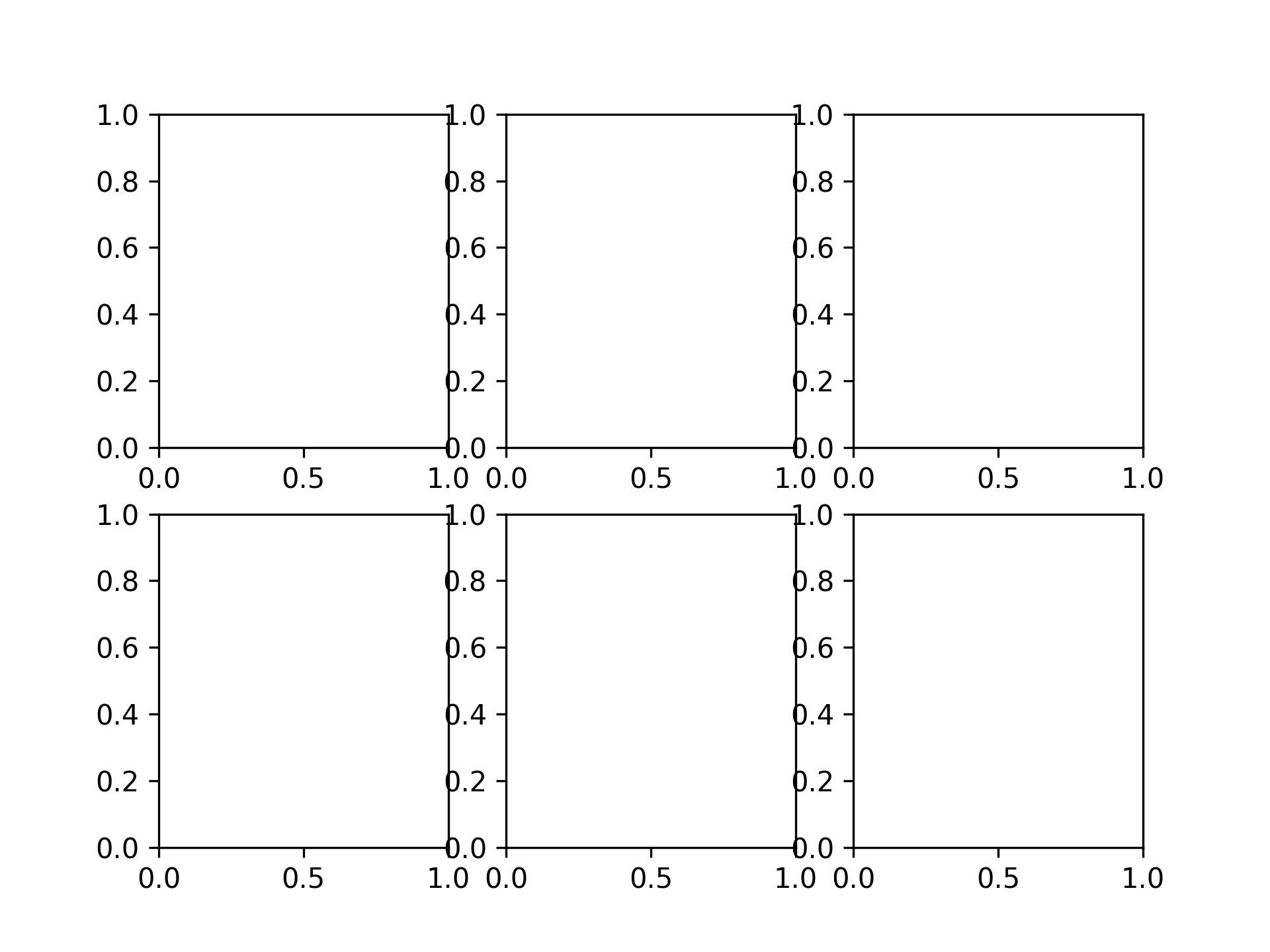
2 x 3 的圖表
fig, axs = plt.subplots(2, 3)
繪製圖表
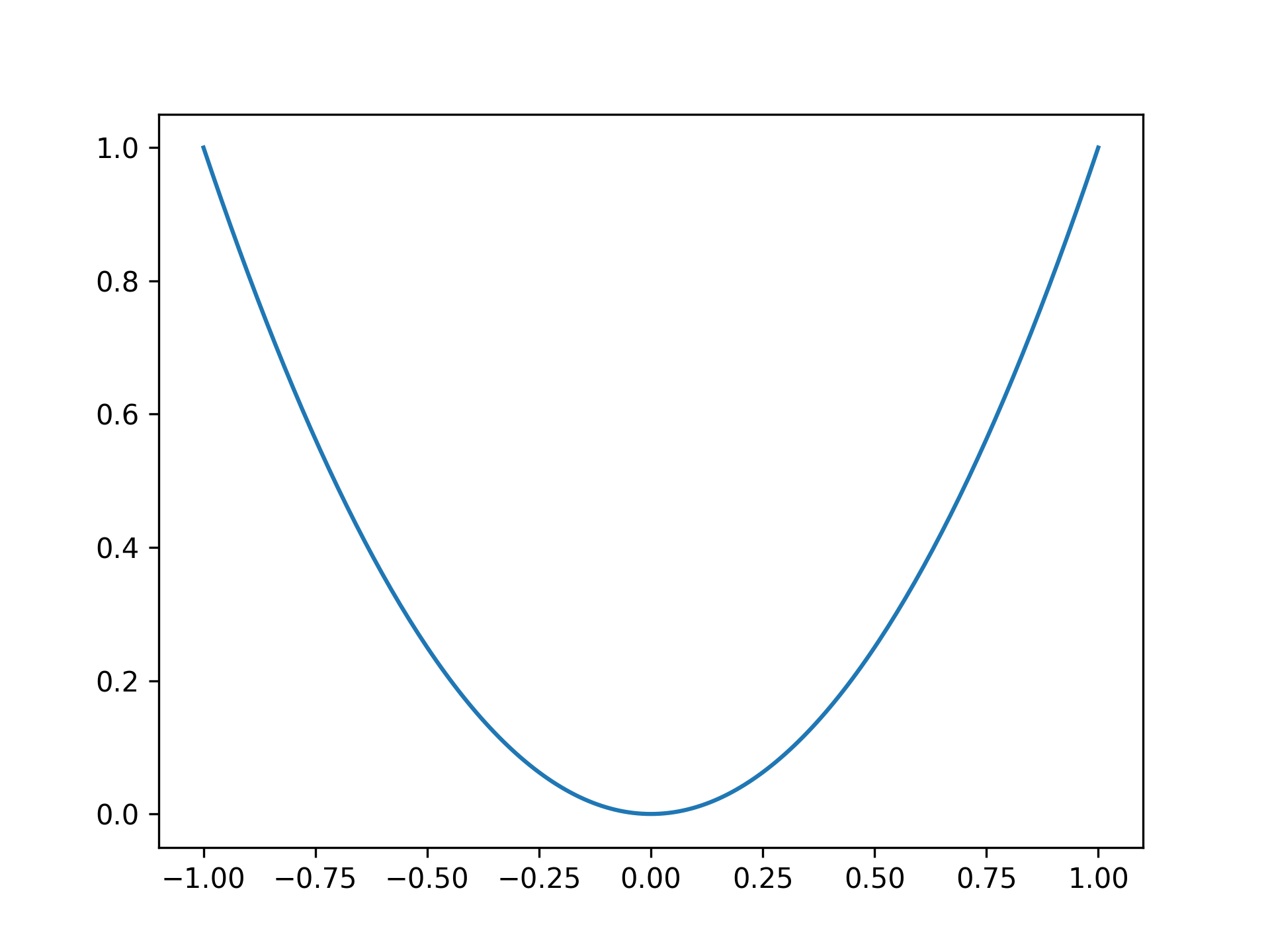
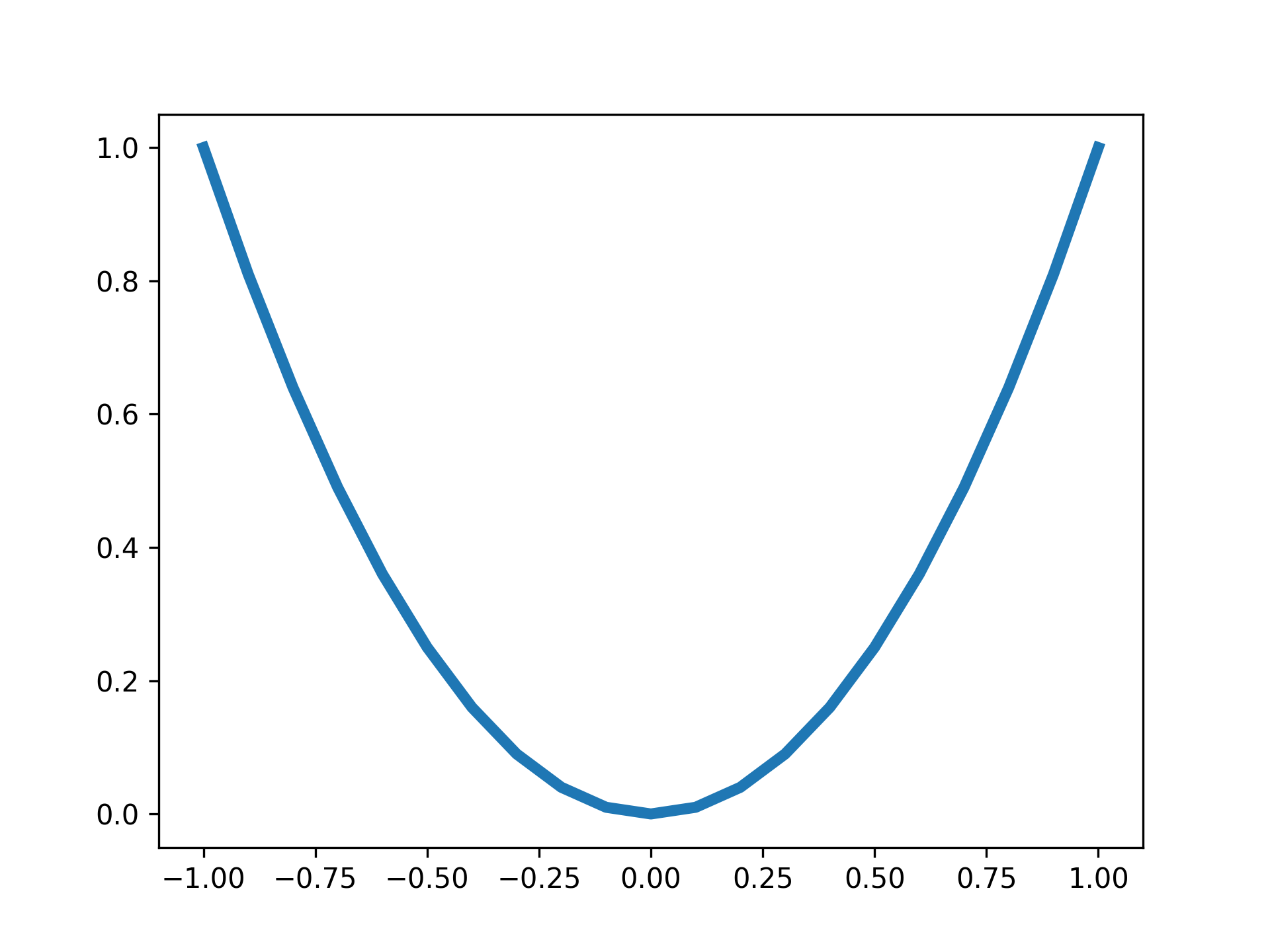
繪製拋物線
x = np.linspace(-1, 1, 201)
y = x ** 2

fig, ax = plt.subplots()
ax.plot(x, y)
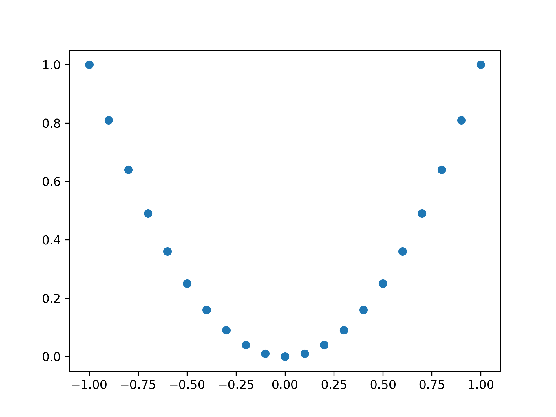
用點繪製拋物線
fig, ax = plt.subplots()

x = np.linspace(-1, 1, 21)
y = x ** 2

ax.plot(x, y, 'o')
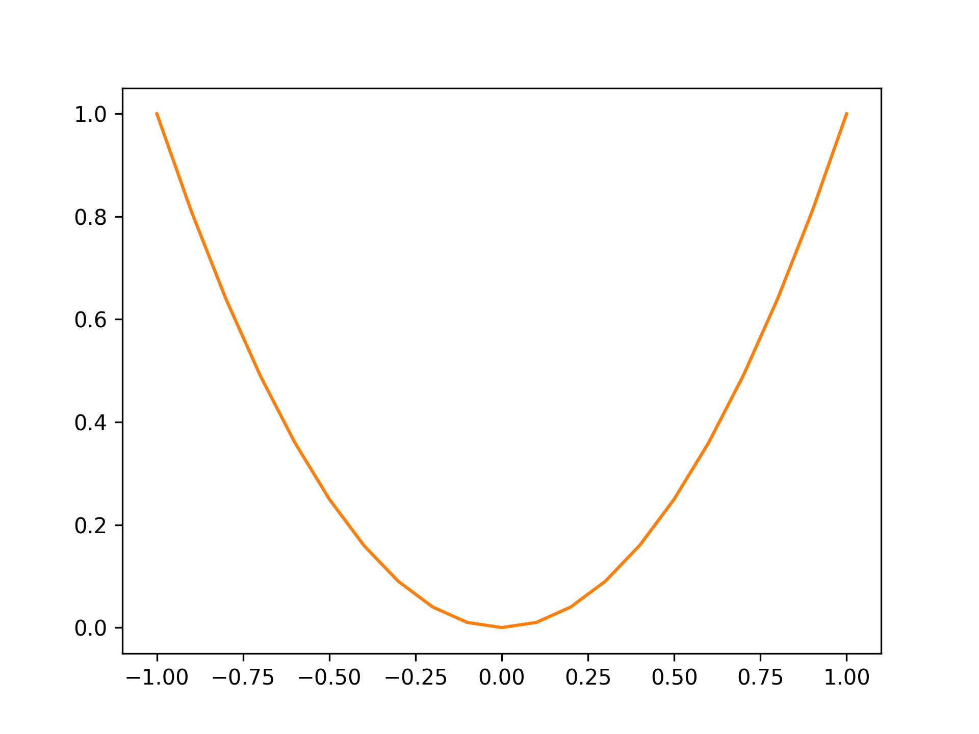
顏色設為橘色
fig, ax = plt.subplots()

x = np.linspace(-1, 1, 21)
y = x ** 2

ax.plot(x, y, color="tab:orange")
標準顏色如下:
| 顏色 | 字串 |
|---|---|
| 藍 | tab:blue |
| 橘 | tab:orange |
| 綠 | tab:green |
| 紅 | tab:red |
| 紫 | tab:purple |
| 棕 | tab:brown |
| 粉紅 | tab:pink |
| 灰 | tab:gray |
| 橄欖 | tab:olive |
| 青 | tab:cyan |
設定線的粗細為 4
fig, ax = plt.subplots()

x = np.linspace(-1, 1, 21)
y = x ** 2

ax.plot(x, y, lw=4)
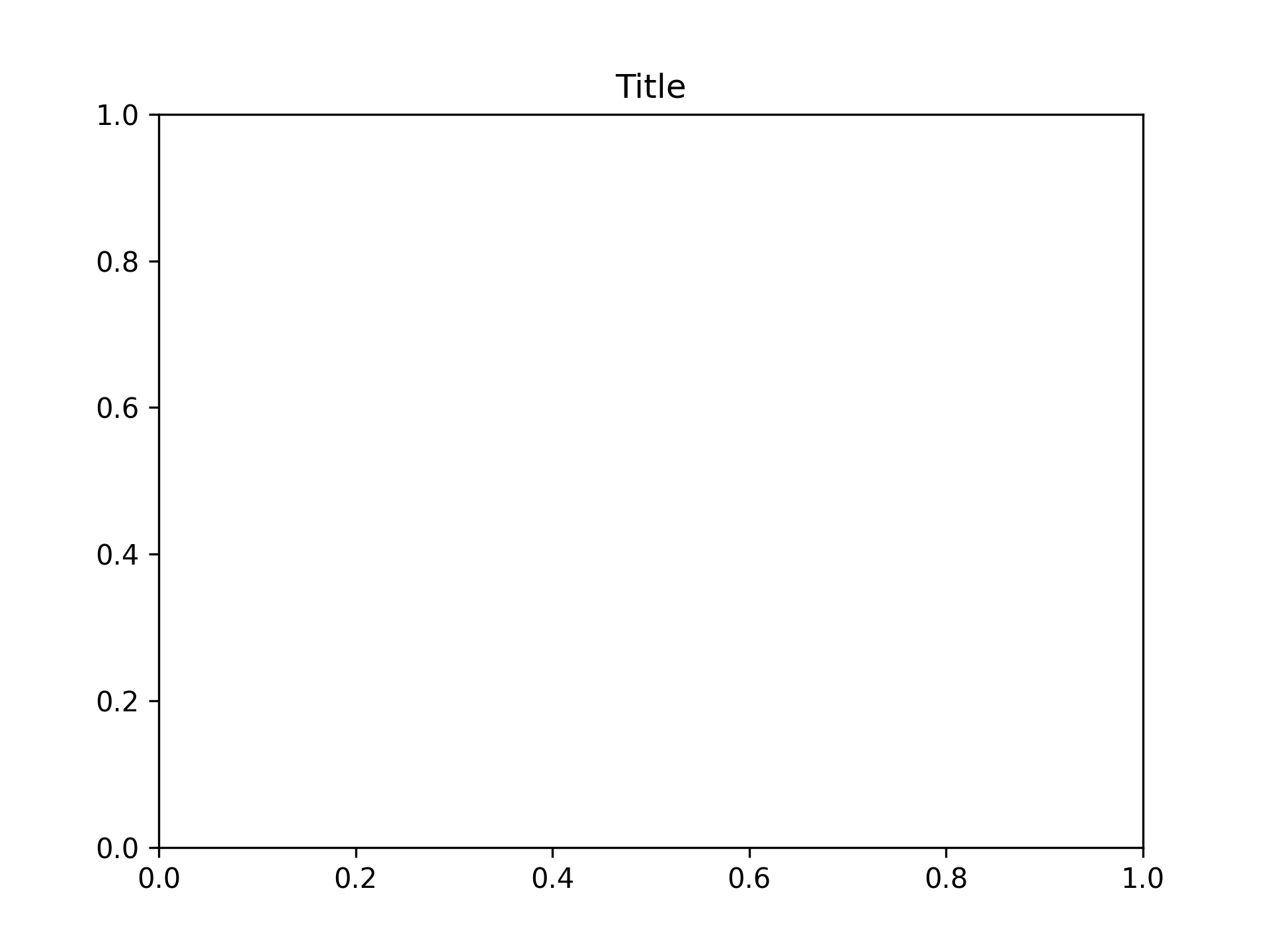
設定標題
將標題設為 Title
fig, ax = plt.subplots()
ax.set_title("Title")
設定軸標籤
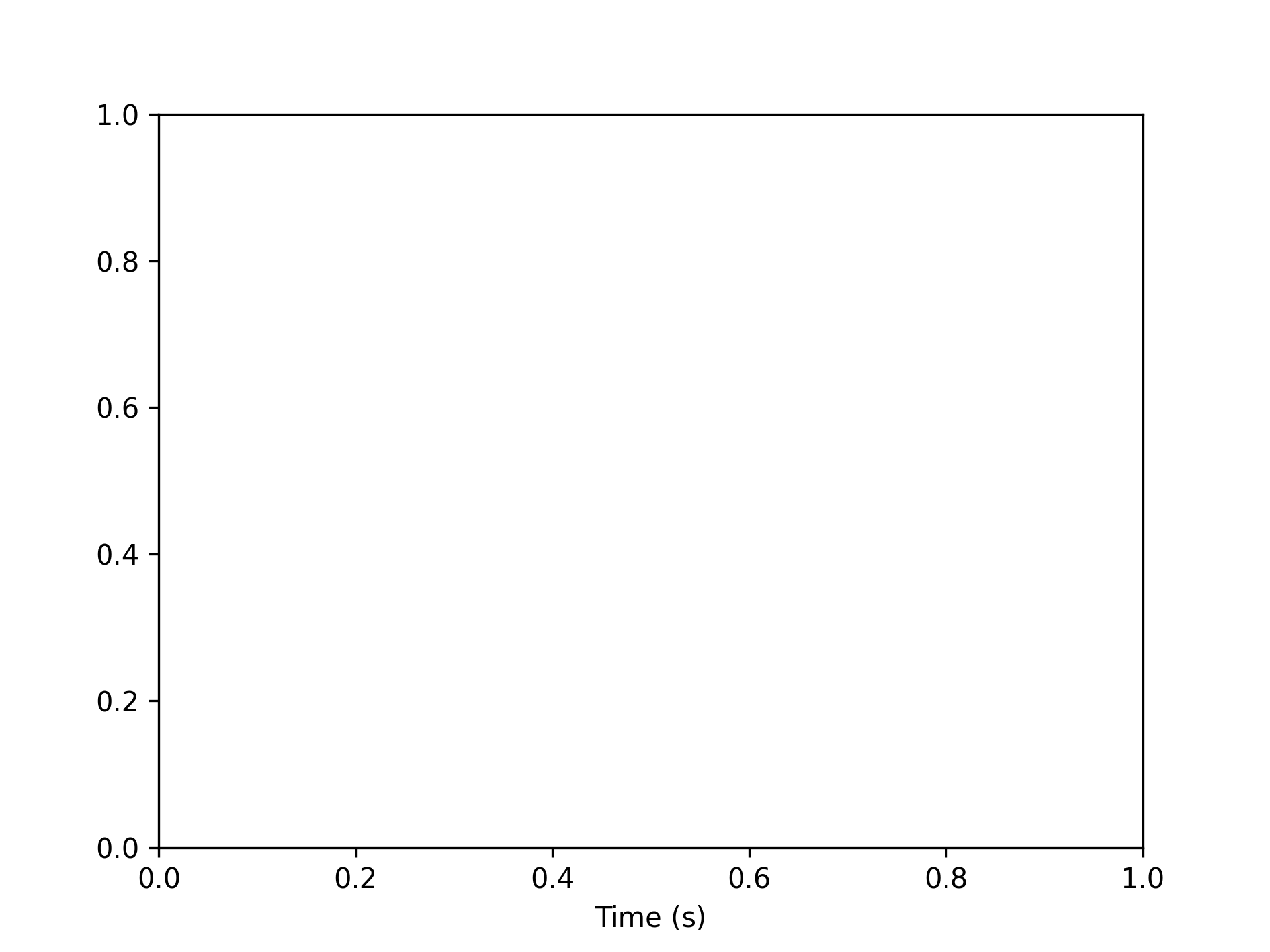
設定 x 軸標籤
將 x 軸標籤設為 Time (s)
fig, ax = plt.subplots()
ax.set_xlabel("Time (s)")
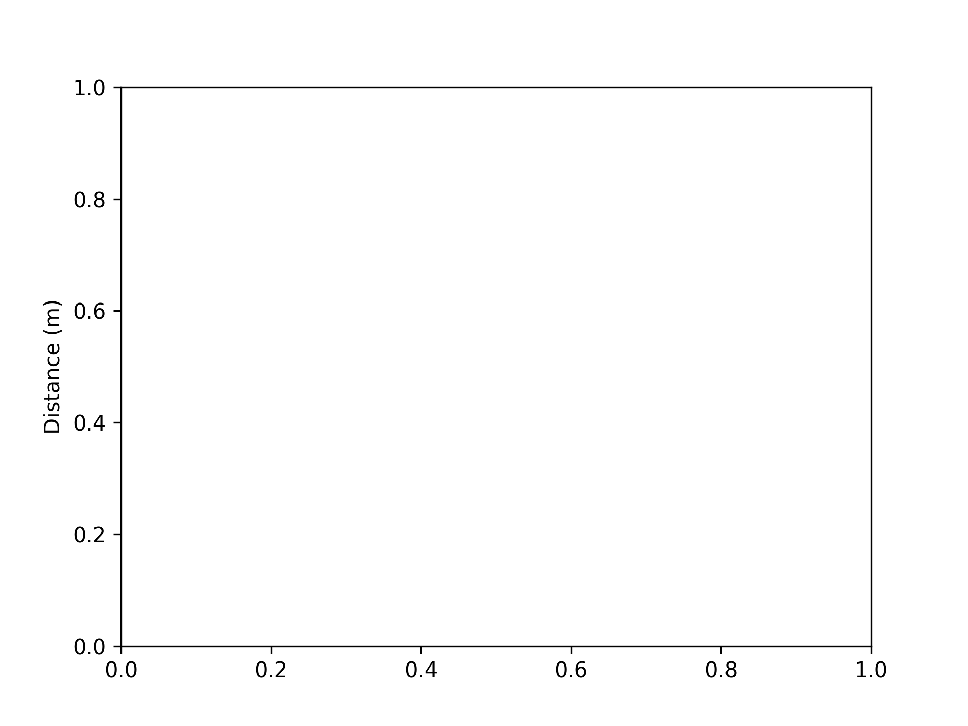
設定 y 軸標籤
將 y 軸標籤設為 Distance (m)
fig, ax = plt.subplots()
ax.set_ylabel("Distance (m)")
設定圖表的上限與下限
將上限設為 100
fig, ax = plt.subplots()
ax.set_ylim(top=100)

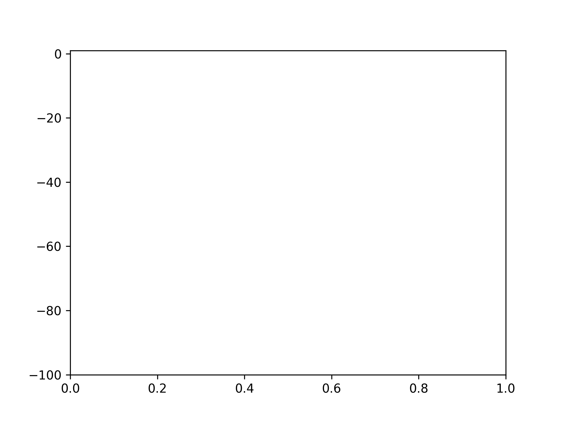
將下限設為 -100
fig, ax = plt.subplots()
ax.set_ylim(bottom=-100)
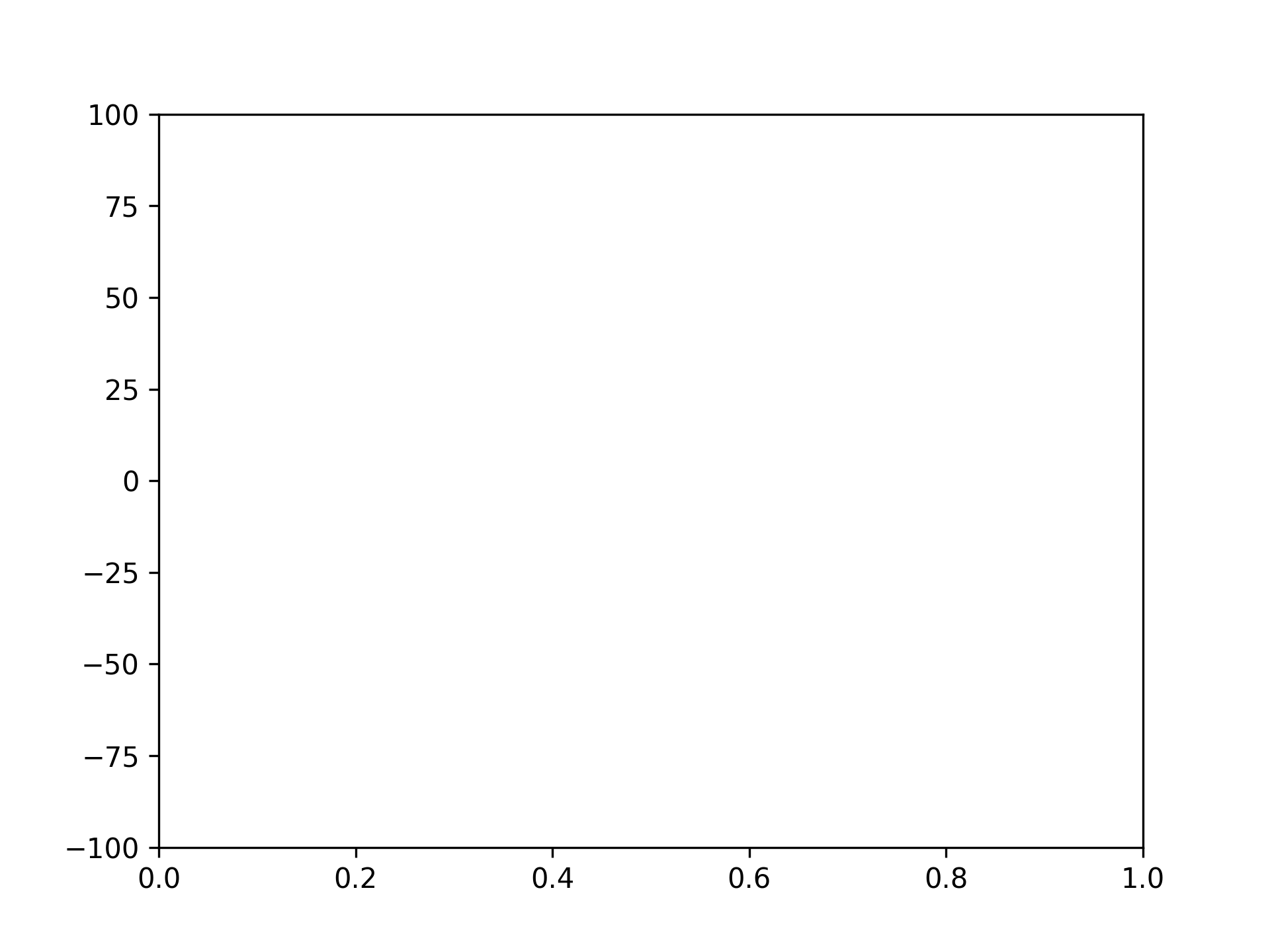
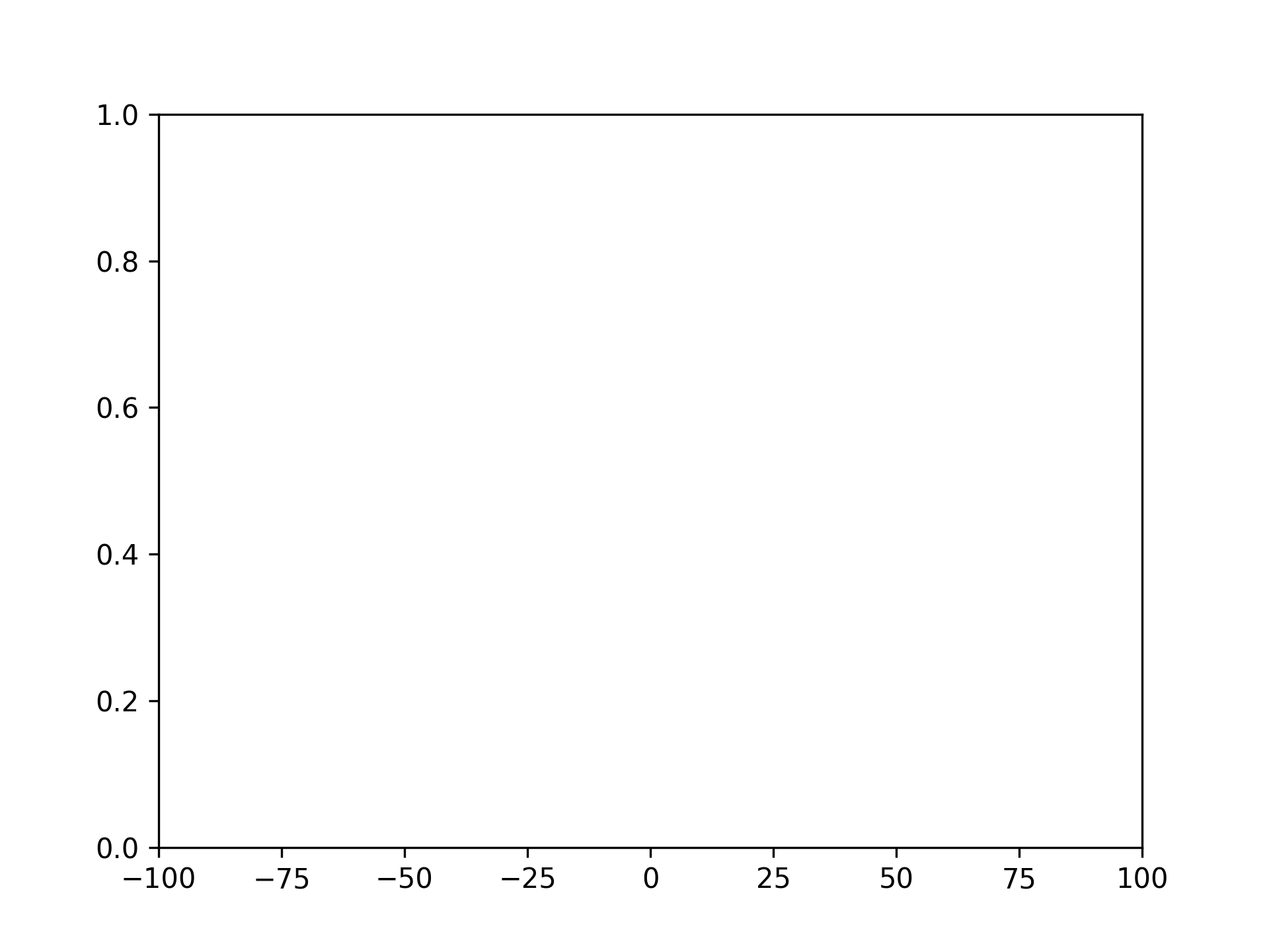
將上限設為 100,下限設為 -100
fig, ax = plt.subplots()
ax.set_ylim([-100, 100])
設定圖表的左邊與右邊
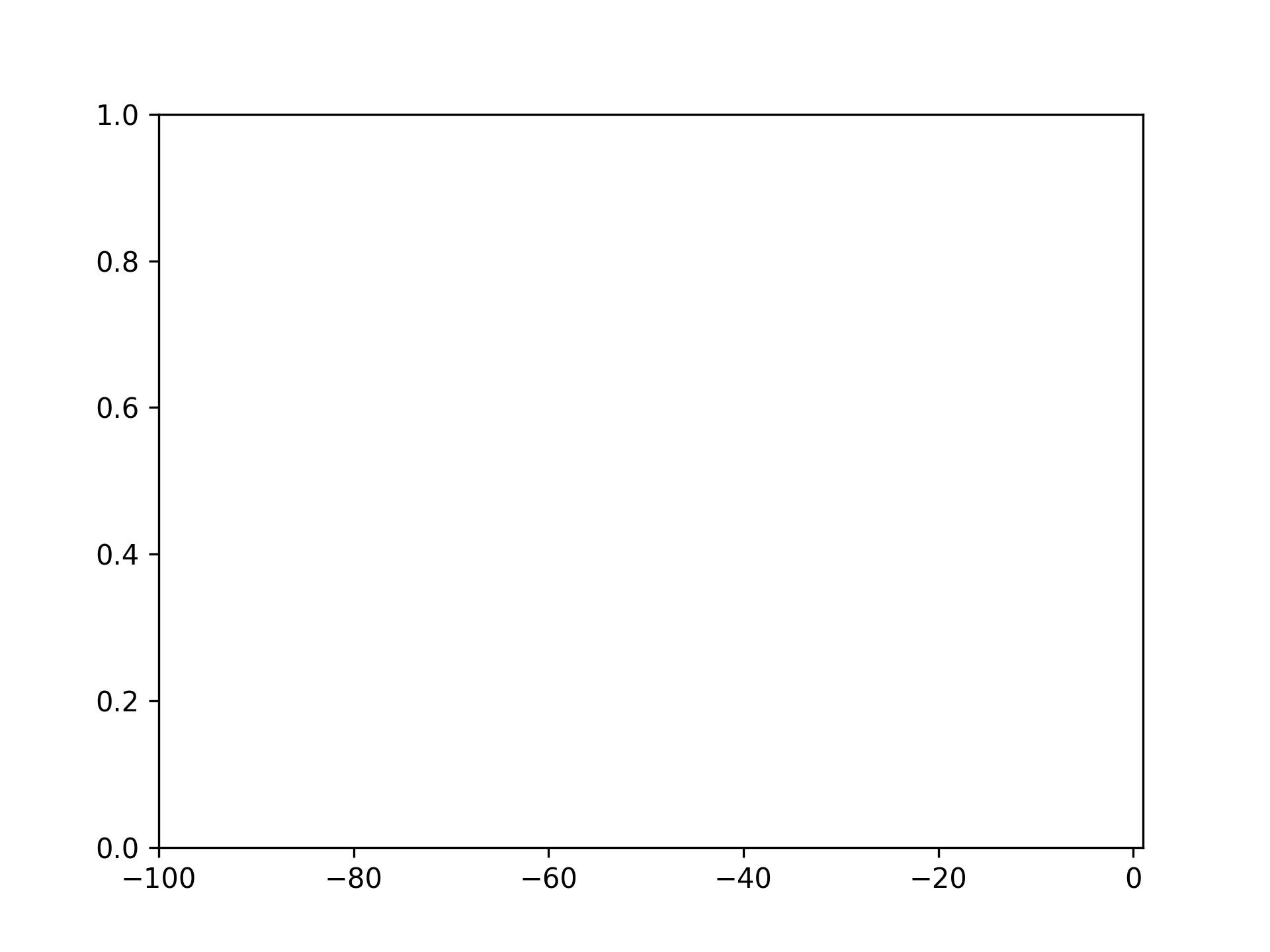
將左邊設為 -100
fig, ax = plt.subplots()
ax.set_xlim(left=-100)
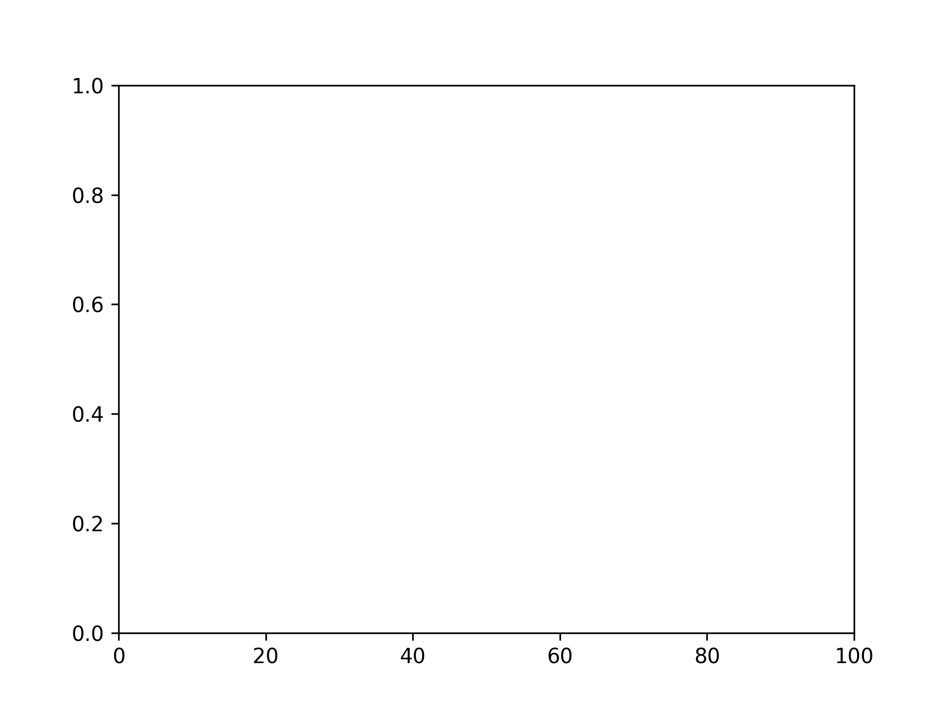
將右邊設為 100
fig, ax = plt.subplots()
ax.set_xlim(right=100)
將左邊設為 -100,右邊設為 100
fig, ax = plt.subplots()
ax.set_xlim([-100, 100])
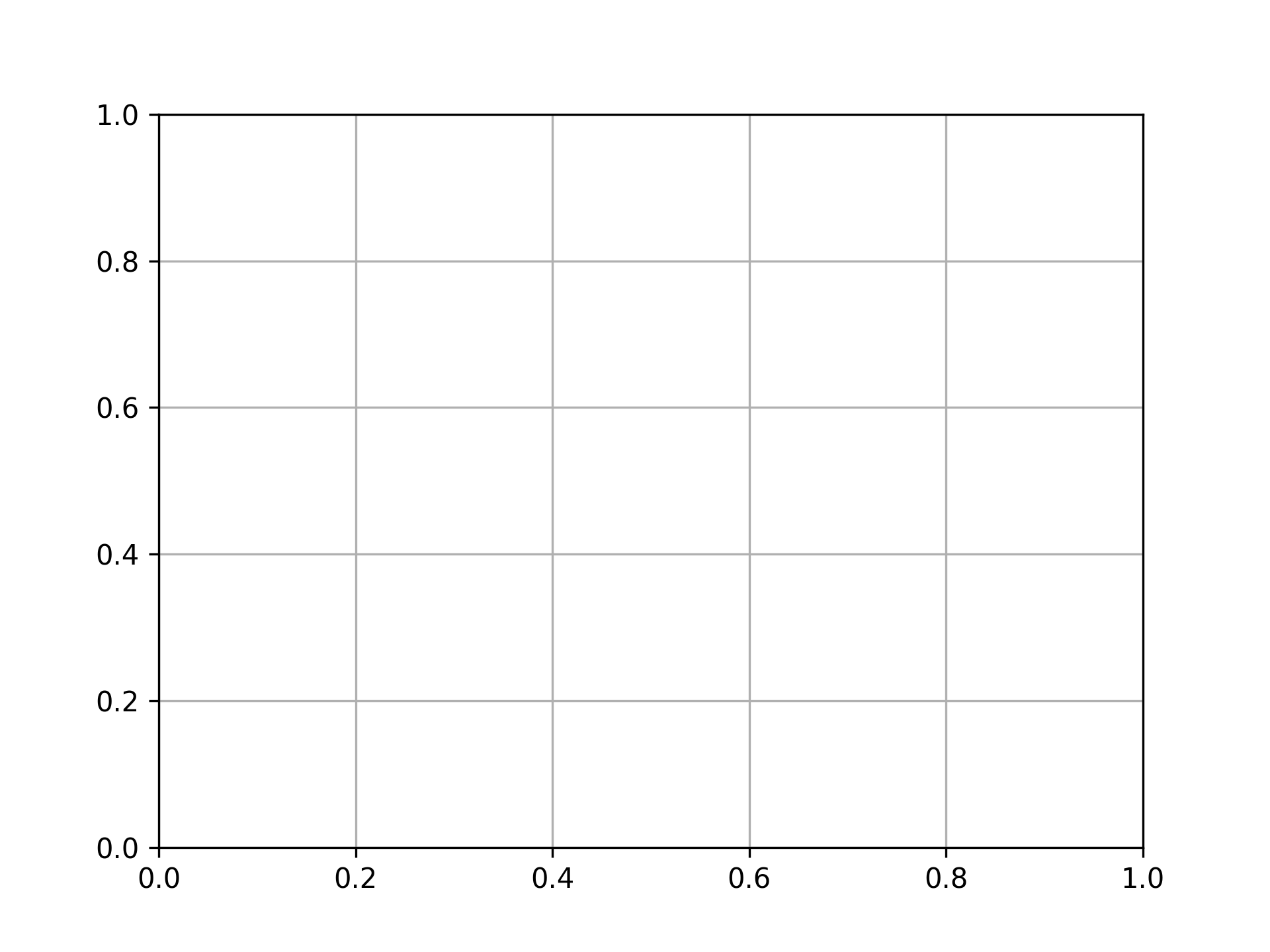
顯示網格
fig, ax = plt.subplots()
ax.grid()
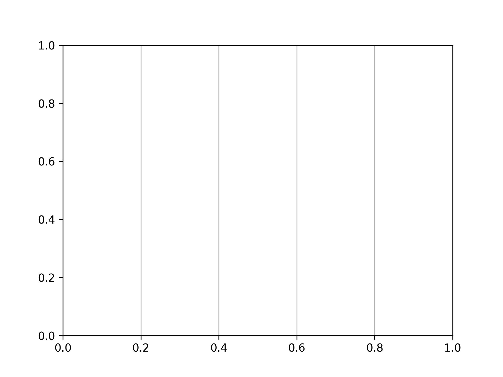
僅顯示垂直網格
fig, ax = plt.subplots()
ax.grid(axis="x")
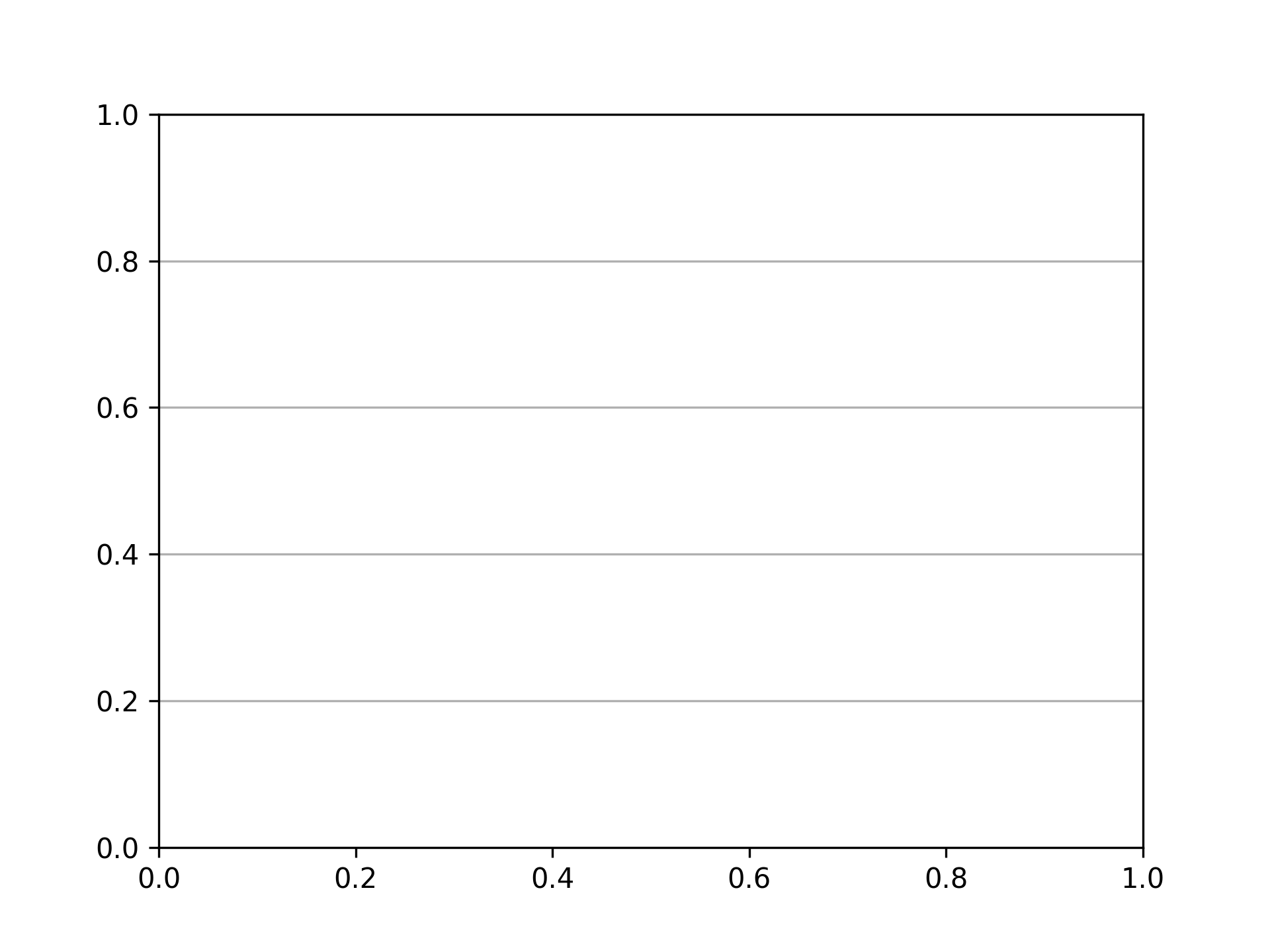
僅顯示水平網格
fig, ax = plt.subplots()
ax.grid(axis="y")
設定刻度
設定 x 軸刻度
fig, ax = plt.subplots()
xticks = range(6)
ax.set_xticks(xticks)
設定 x 軸刻度和刻度標籤
fig, ax = plt.subplots()
xticks = range(6)
ax.set_xticks(xticks, [f"{xtick}m" for xtick in xticks])

設定 y 軸刻度
fig, ax = plt.subplots()
yticks = [i * 20 for i in range(6)]
ax.set_yticks(yticks)
設定 y 軸刻度和刻度標籤
fig, ax = plt.subplots()
yticks = [i * 20 for i in range(6)]
ax.set_yticks(yticks, [f"{ytick}%" for ytick in yticks])
刪除刻度
刪除 x 軸刻度
fig, ax = plt.subplots()
ax.tick_params(bottom=False)

刪除 x 軸刻度標籤
fig, ax = plt.subplots()
ax.tick_params(labelbottom=False)
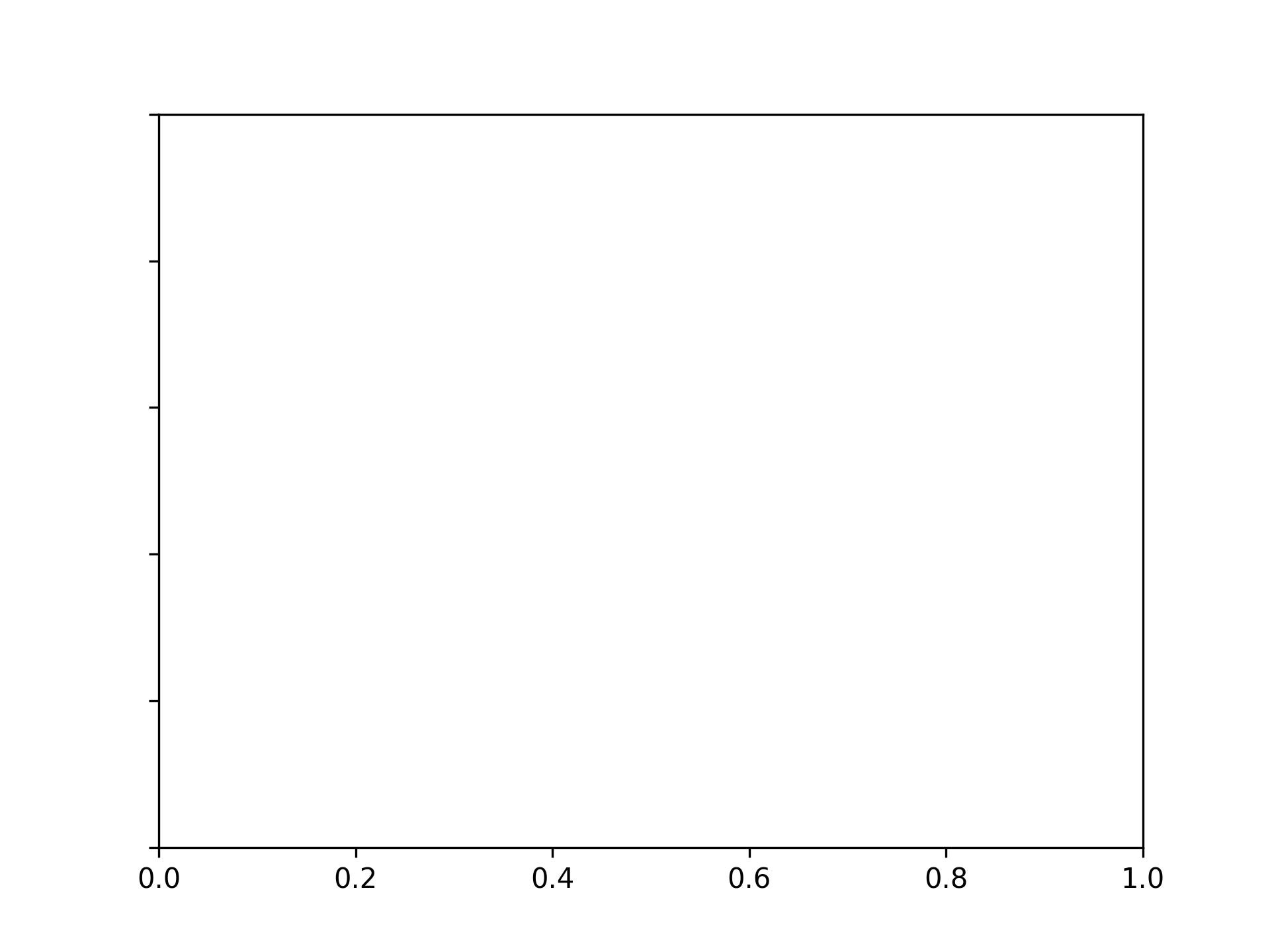
刪除 y 軸刻度
fig, ax = plt.subplots()
ax.tick_params(left=False)
刪除 y 軸刻度標籤
fig, ax = plt.subplots()
ax.tick_params(labelleft=False)
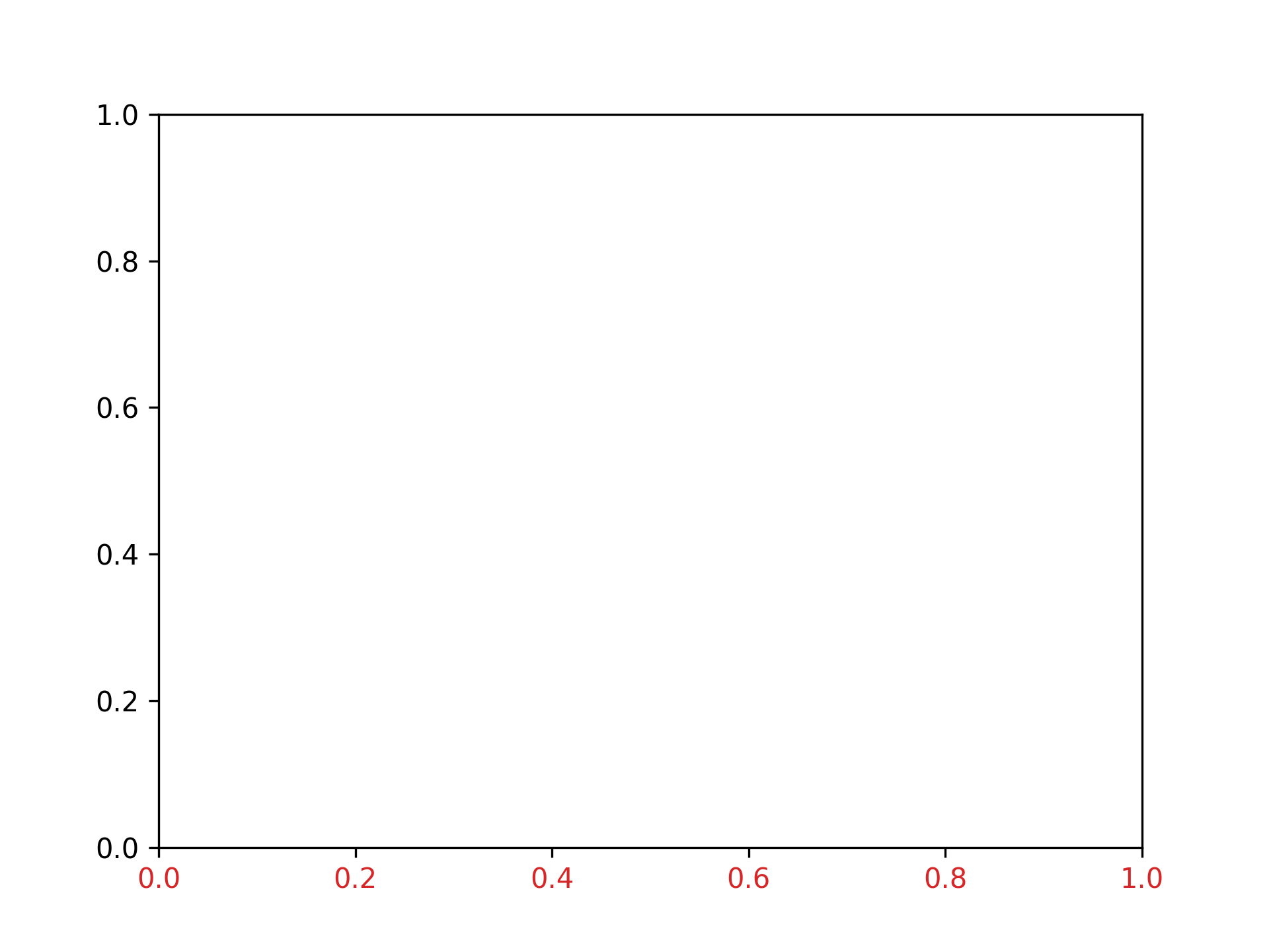
設定刻度顏色
將 x 軸刻度顏色設為紅色
fig, ax = plt.subplots()
ax.tick_params(axis="x", color="tab:red")

將 x 軸刻度標籤顏色設為紅色
fig, ax = plt.subplots()
ax.tick_params(axis="x", labelcolor="tab:red")
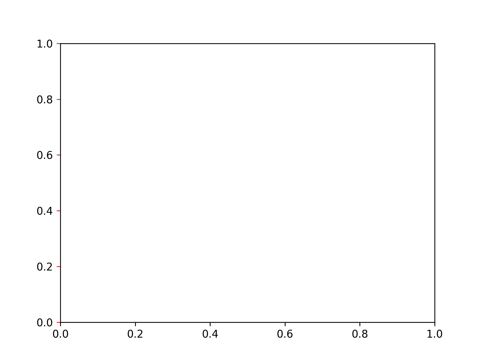
將 y 軸刻度顏色設為紅色
fig, ax = plt.subplots()
ax.tick_params(axis="y", color="tab:red")
將 y 軸刻度標籤顏色設為紅色
fig, ax = plt.subplots()
ax.tick_params(axis="y", labelcolor="tab:red")
調整圖表間距
將縱向間距設為 0.2,橫向間距設為 0.3
fig, ax = plt.subplots(3, 3)
fig.subplots_adjust(hspace=0.2, wspace=0.3)
自動設定間距
fig, ax = plt.subplots(3, 3)
fig.tight_layout()
儲存圖片
以 PNG 格式儲存
fig, ax = plt.subplots()
plt.savefig("graph.png")

以 SVG 格式儲存
fig, ax = plt.subplots()
plt.savefig("svg.png")

以 PDF 格式儲存
fig, ax = plt.subplots()
plt.savefig("svg.pdf")
以 300 dpi 儲存
fig, ax = plt.subplots()
plt.savefig("graph300.png", dpi=300)

載入中...