Mastering CSS Grid
Creating a Grid
5 Rows, 3 Columns Grid
Let's try creating a grid with 5 rows and 3 columns.
<div id="wrap">
    <div id="elem">要素</div>
</div>
#wrap{
    display: grid;
    grid-template-columns: repeat(3, 1fr);
    grid-template-rows: repeat(5, 1fr);
}
1fr denotes an equal fraction of the available space. repeat(3, 1fr) is equivalent to repeating 1fr three times, which, when written out, would be 1fr 1fr 1fr.
Also, auto is used when you want the grid items to adjust their size to the content within the grid.
Placing Items
After defining the grid, we place the items.
Item placement is done using grid-row and grid-column. (However, it's also possible to use grid-row-start, grid-row-end, grid-column-start, and grid-column-end.)
Let's say we want to place an item at row 4, column 2, as shown in the figure.
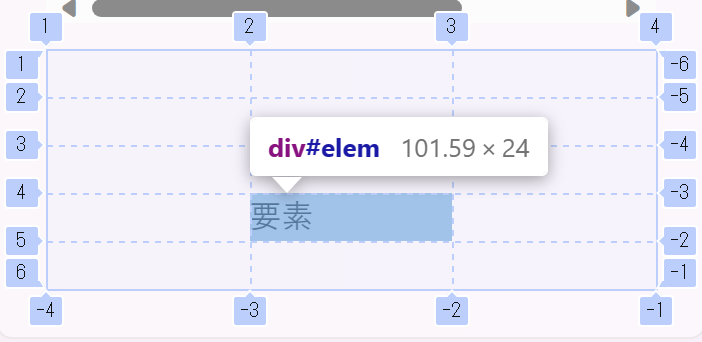
Since the 4th row is between lines 4 and 5, we set grid-row: 4 / 5;,
and since the 2nd column is between lines 2 and 3, we set grid-column: 2 / 3;.
#elem{
    grid-column: 2 / 3;
    grid-row: 4 / 5;
}
Full-width Placement
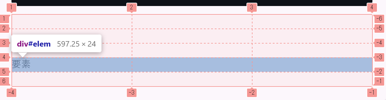
If you want to place an item across the full width of the 4th row,
since the columns span from 1 to -1, you'd use grid-column: 1 / -1. (In this layout, grid-column: 1 / 4 would also work, but we use -1 for the end.)
#elem{
    grid-column: 1 / -1; /* grid-column: 1 / 4; is also acceptable */
    grid-row: 4 / 5;
}
Example using span
The span keyword allows an item to span across multiple rows or columns. (However, this can also be achieved without using span.)
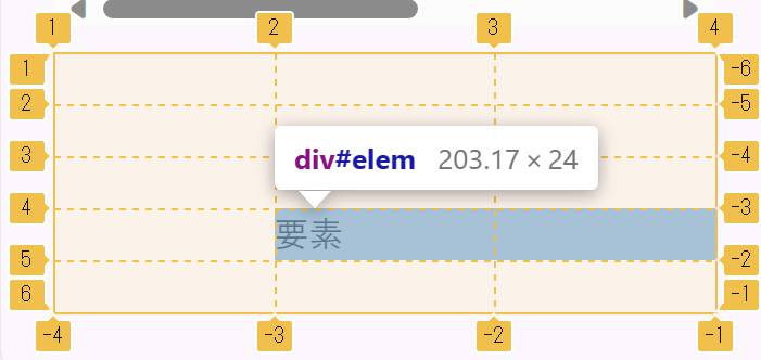
If you want to place an item spanning columns 2 and 3, you'd use grid-column: 2 / span 2;.
#elem{
    grid-column: 2 / span 2;
    grid-row: 4 / 5;
}
This concludes the explanation of Grid.
Loading...