Common Matplotlib (Pyplot) Code Examples
I'll introduce commonly used code examples with graphs.
Table of Contents
- Creating Graphs
- Plotting Graphs
- Setting Titles
- Setting Axis Labels
- Setting Graph Top and Bottom
- Setting Graph Left and Right
- Displaying Grid
- Setting Ticks
- Removing Ticks
- Setting Tick Colors
- Adjusting Graph Spacing
- Saving Images
Creating Graphs
First, import the required libraries.
import matplotlib.pyplot as plt
import numpy as np
Single Graph
fig, ax = plt.subplots()

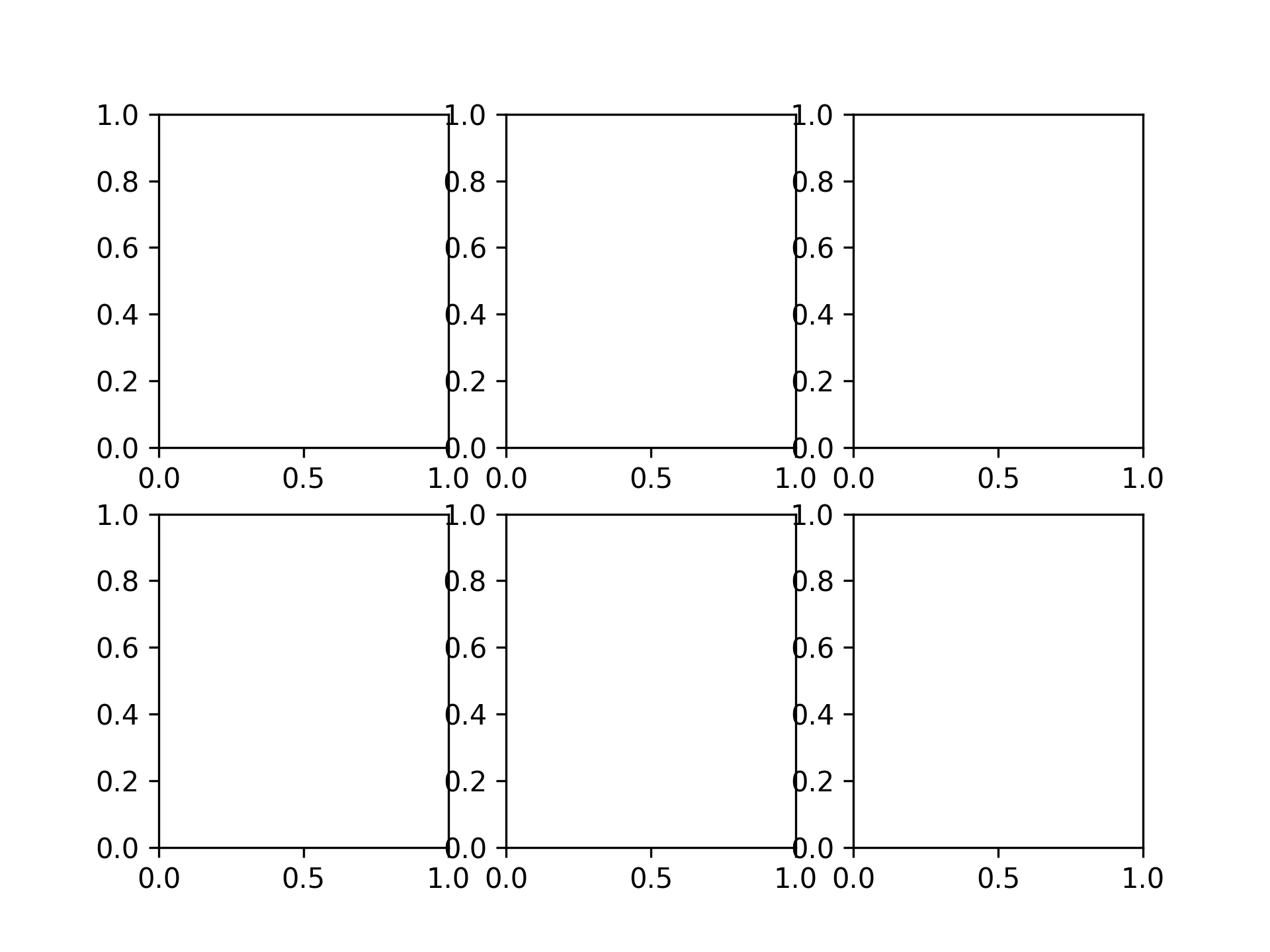
2 x 3 Graphs
fig, axs = plt.subplots(2, 3)
Plotting Graphs
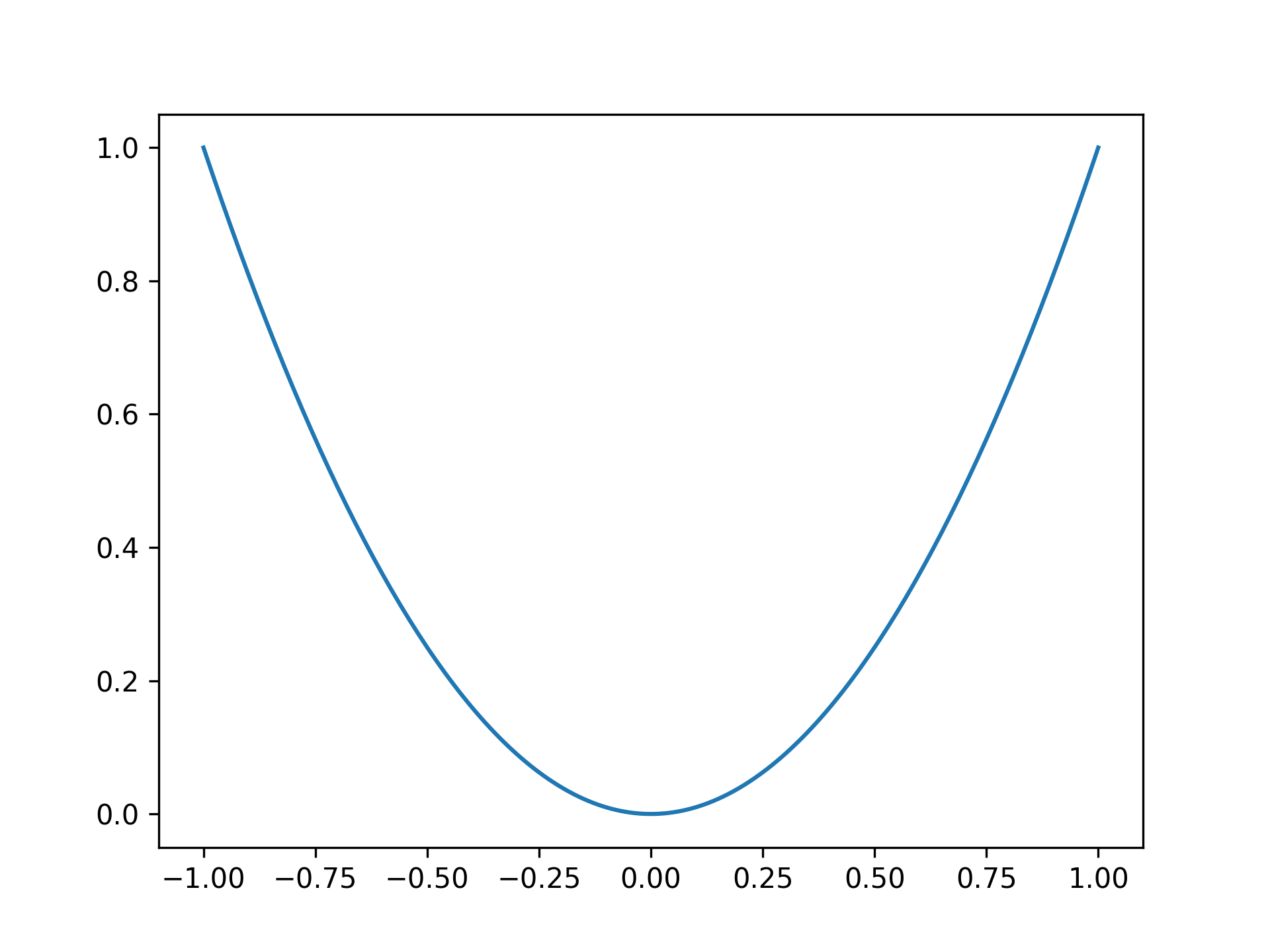
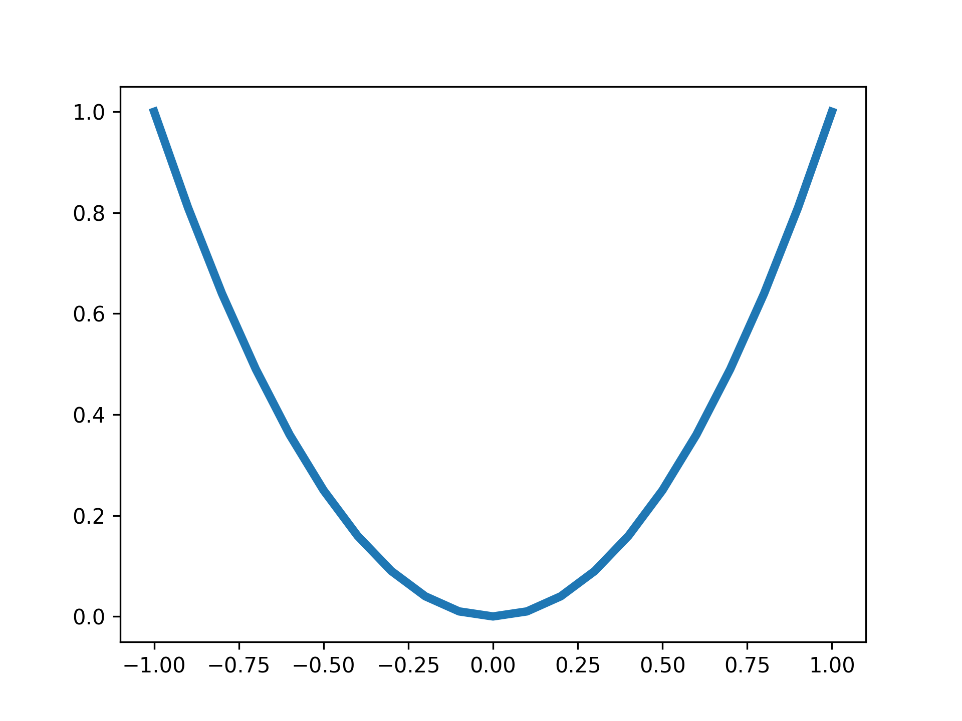
Plotting a parabola
x = np.linspace(-1, 1, 201)
y = x ** 2

fig, ax = plt.subplots()
ax.plot(x, y)
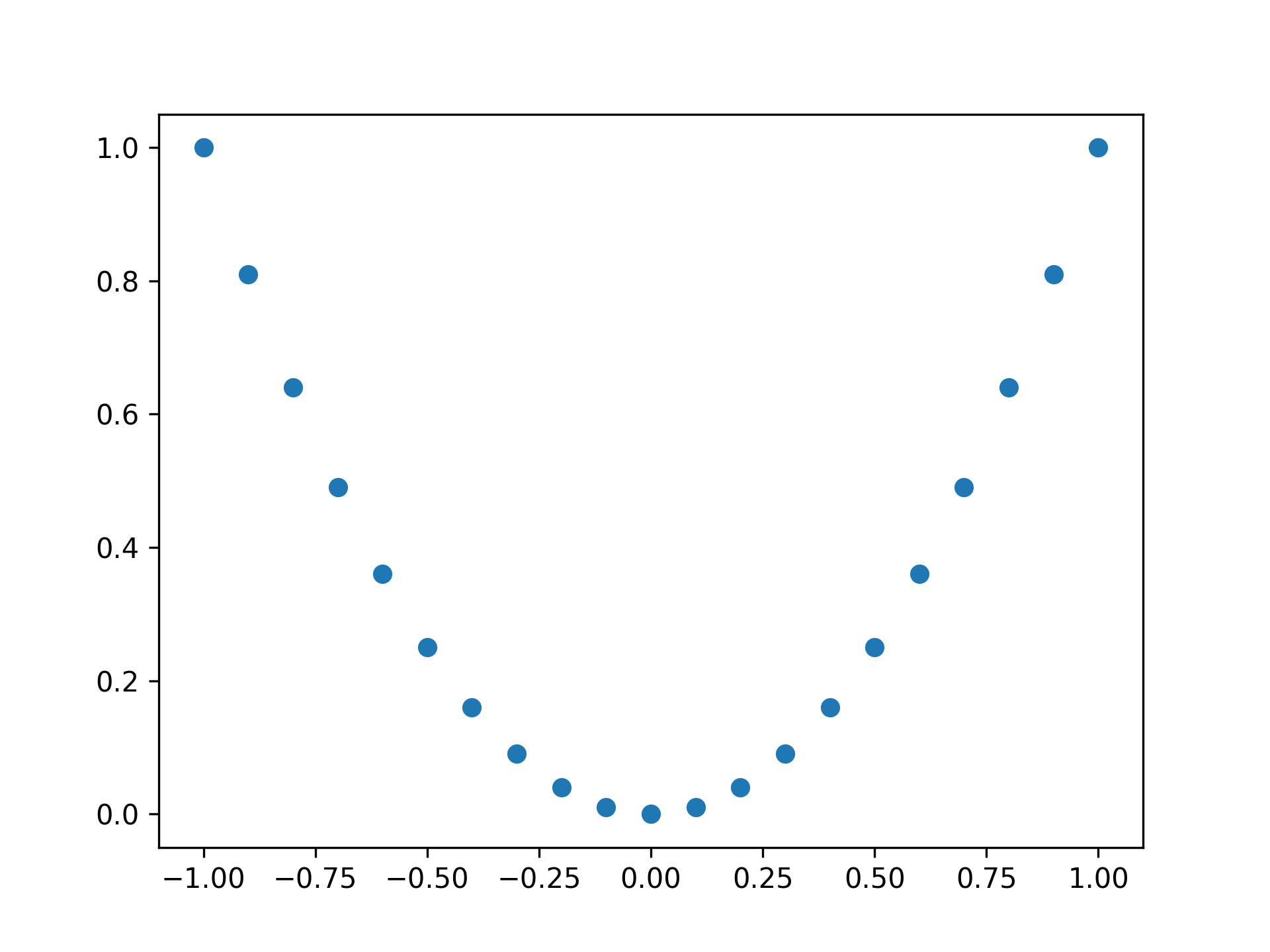
Plotting a parabola with points
fig, ax = plt.subplots()

x = np.linspace(-1, 1, 21)
y = x ** 2

ax.plot(x, y, 'o')
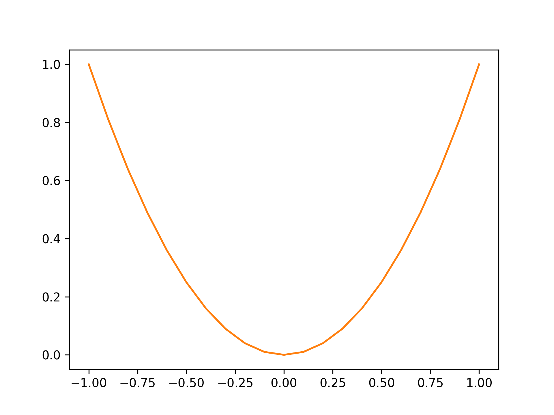
Setting color to orange
fig, ax = plt.subplots()

x = np.linspace(-1, 1, 21)
y = x ** 2

ax.plot(x, y, color="tab:orange")
Standard colors are as follows:
| Color | String |
|---|---|
| Blue | tab:blue |
| Orange | tab:orange |
| Green | tab:green |
| Red | tab:red |
| Purple | tab:purple |
| Brown | tab:brown |
| Pink | tab:pink |
| Gray | tab:gray |
| Olive | tab:olive |
| Cyan | tab:cyan |
Setting line width to 4
fig, ax = plt.subplots()

x = np.linspace(-1, 1, 21)
y = x ** 2

ax.plot(x, y, lw=4)
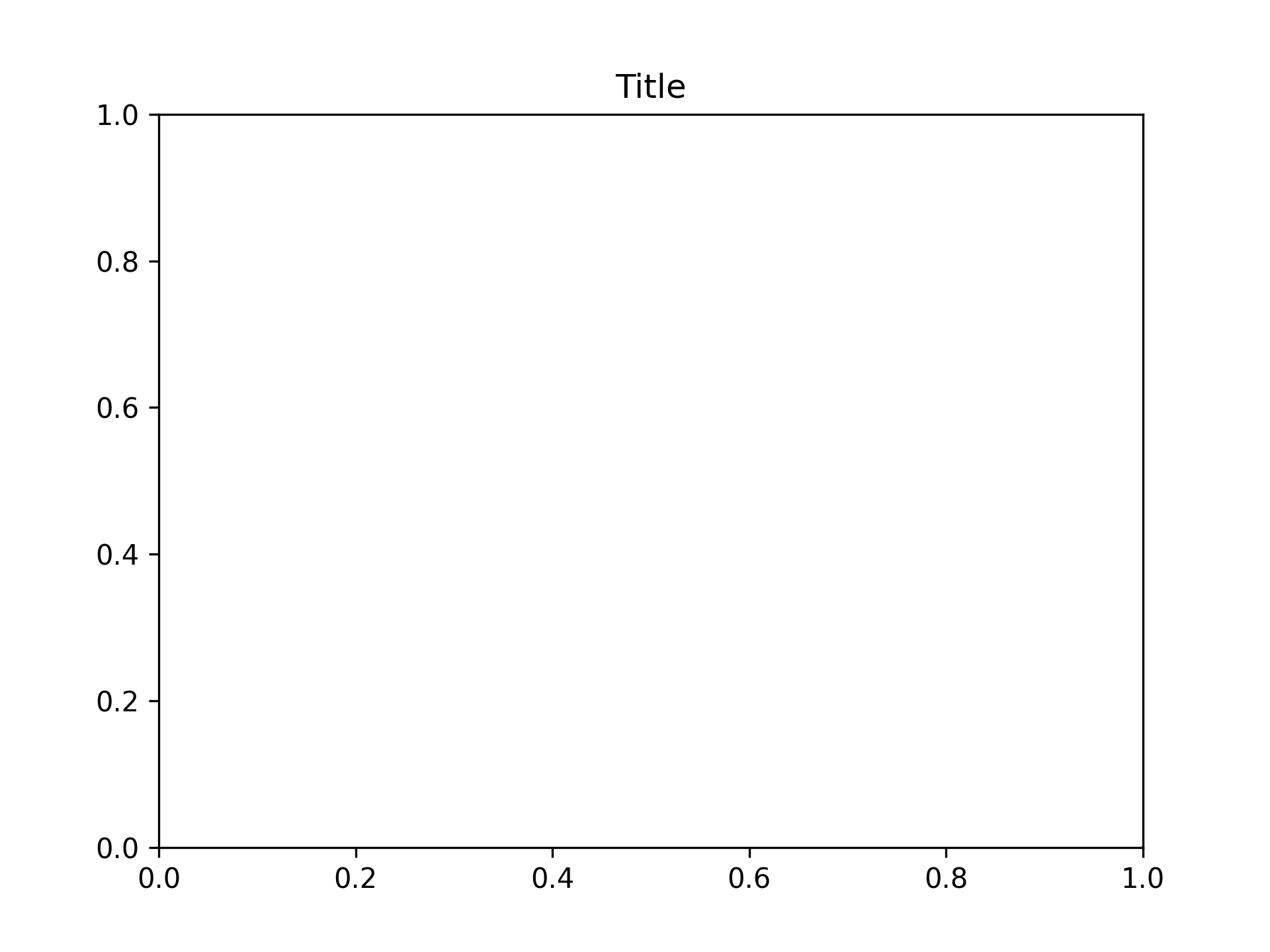
Setting Titles
Setting title to "Title"
fig, ax = plt.subplots()
ax.set_title("Title")
Setting Axis Labels
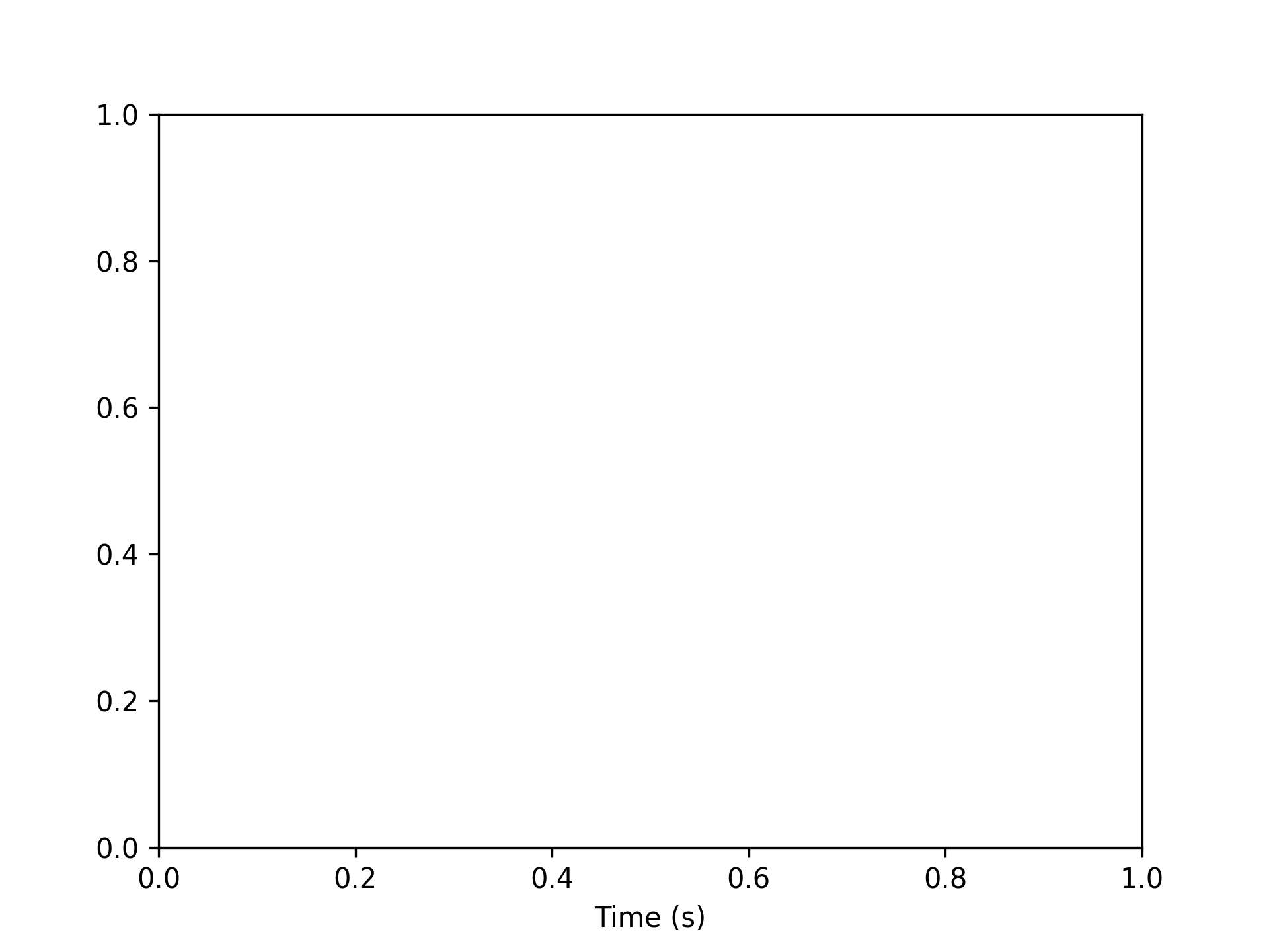
Setting X-Axis Labels
Setting x-axis label to "Time (s)"
fig, ax = plt.subplots()
ax.set_xlabel("Time (s)")
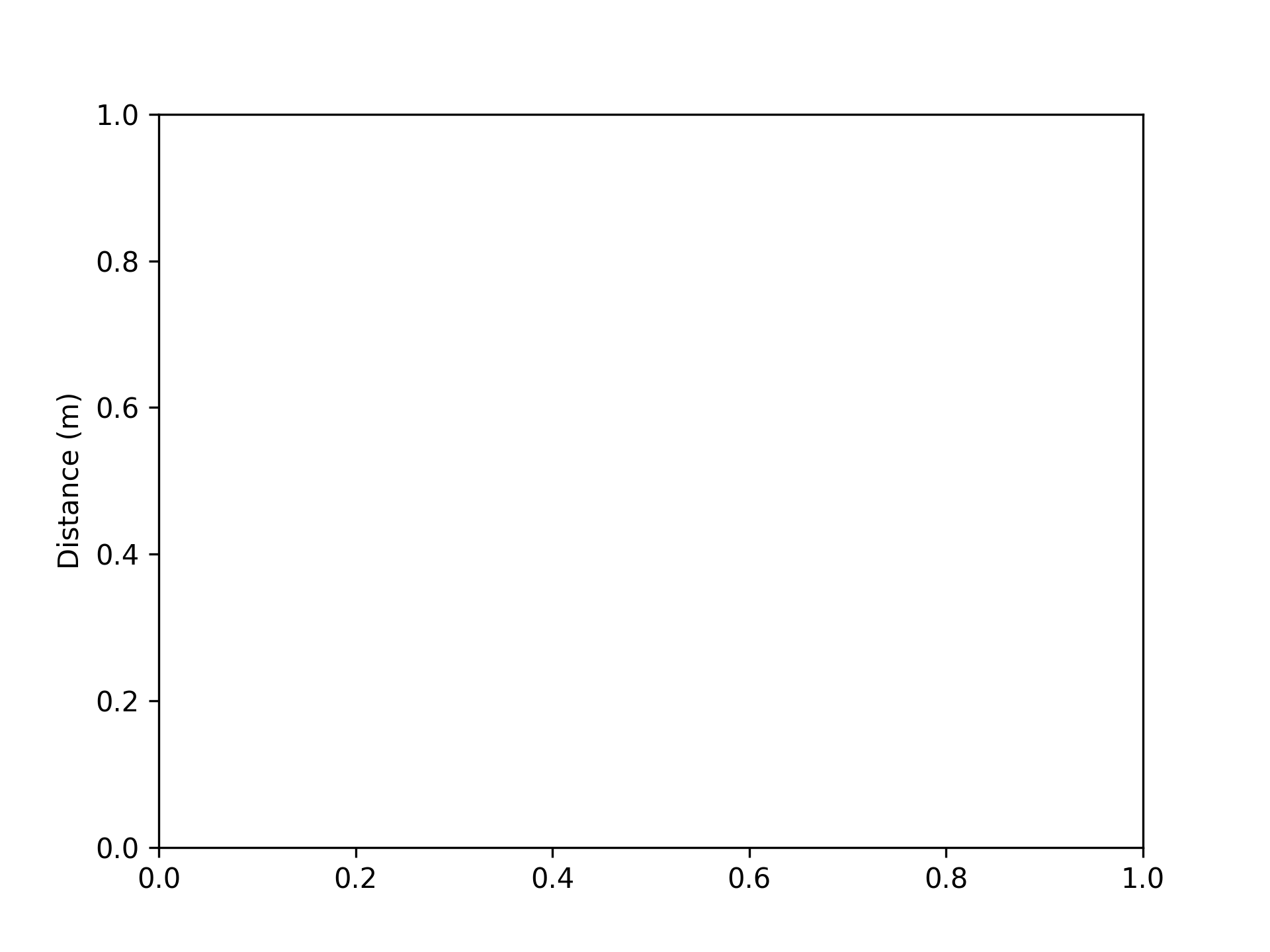
Setting Y-Axis Labels
Setting y-axis label to "Distance (m)"
fig, ax = plt.subplots()
ax.set_ylabel("Distance (m)")
Setting Graph Top and Bottom
Setting top to 100
fig, ax = plt.subplots()
ax.set_ylim(top=100)

Setting bottom to -100
fig, ax = plt.subplots()
ax.set_ylim(bottom=-100)
Setting top to 100 and bottom to -100
fig, ax = plt.subplots()
ax.set_ylim([-100, 100])
Setting Graph Left and Right
Setting left to -100
fig, ax = plt.subplots()
ax.set_xlim(left=-100)
Setting right to 100
fig, ax = plt.subplots()
ax.set_xlim(right=100)
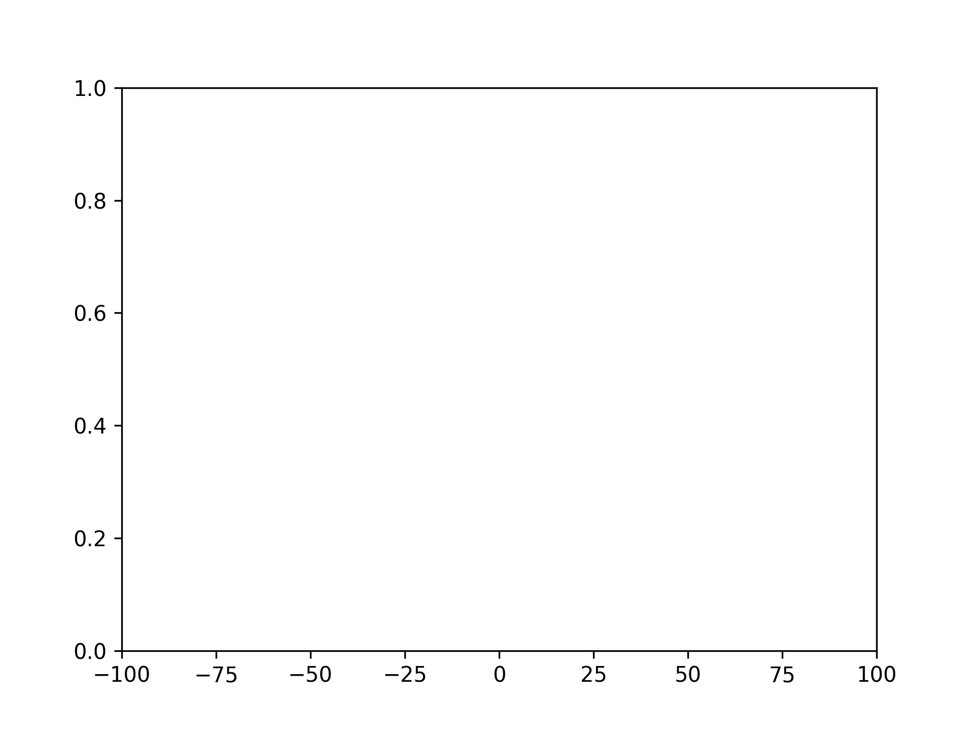
Setting left to -100 and right to 100
fig, ax = plt.subplots()
ax.set_xlim([-100, 100])
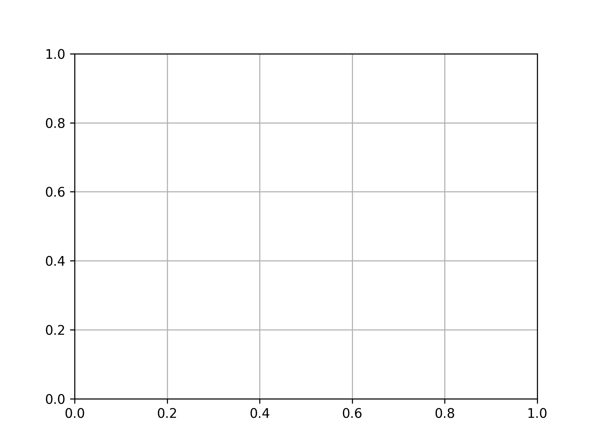
Displaying Grid
fig, ax = plt.subplots()
ax.grid()
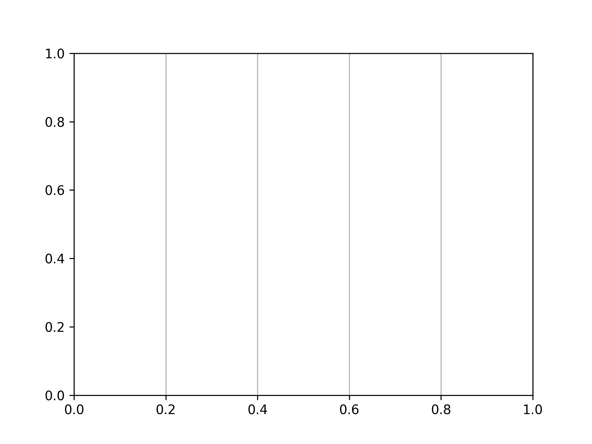
Displaying grid vertically only
fig, ax = plt.subplots()
ax.grid(axis="x")
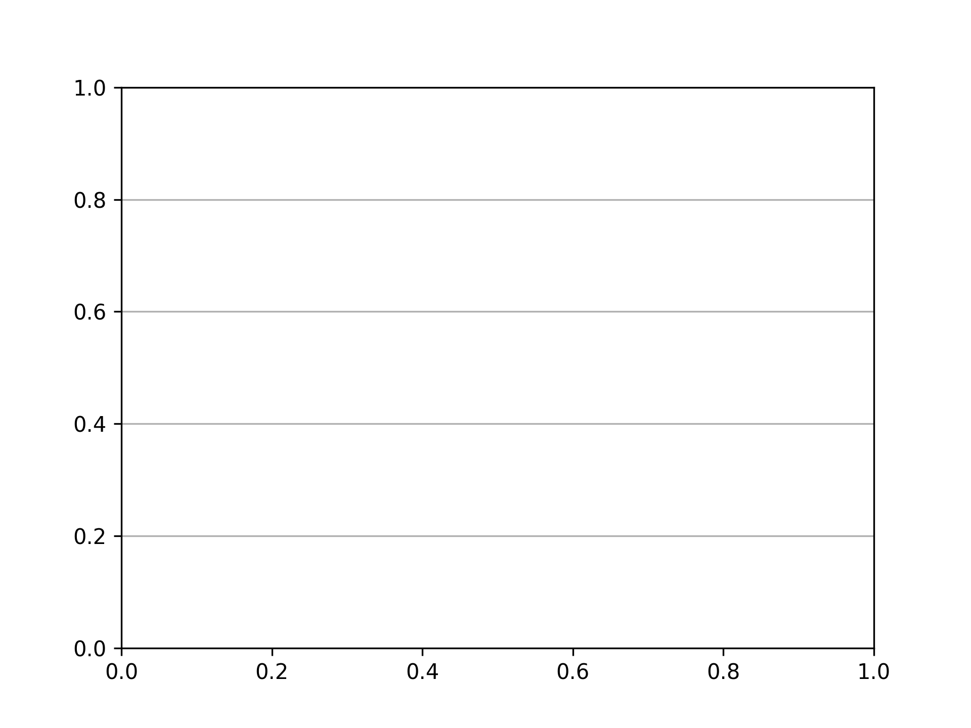
Displaying grid horizontally only
fig, ax = plt.subplots()
ax.grid(axis="y")
Setting Ticks
Setting x-axis ticks
fig, ax = plt.subplots()
xticks = range(6)
ax.set_xticks(xticks)
Setting x-axis ticks and tick labels
fig, ax = plt.subplots()
xticks = range(6)
ax.set_xticks(xticks, [f"{xtick}m" for xtick in xticks])

Setting y-axis ticks
fig, ax = plt.subplots()
yticks = [i * 20 for i in range(6)]
ax.set_yticks(yticks)
Setting y-axis ticks and tick labels
fig, ax = plt.subplots()
yticks = [i * 20 for i in range(6)]
ax.set_yticks(yticks, [f"{ytick}%" for ytick in yticks])
Removing Ticks
Removing x-axis ticks
fig, ax = plt.subplots()
ax.tick_params(bottom=False)
Removing x-axis tick labels
fig, ax = plt.subplots()
ax.tick_params(labelbottom=False)
Removing y-axis ticks
fig, ax = plt.subplots()
ax.tick_params(left=False)
Removing y-axis tick labels
fig, ax = plt.subplots()
ax.tick_params(labelleft=False)
Setting Tick Colors
Setting x-axis tick color to red
fig, ax = plt.subplots()
ax.tick_params(axis="x", color="tab:red")

Setting x-axis tick label color to red
fig, ax = plt.subplots()
ax.tick_params(axis="x", labelcolor="tab:red")
Setting y-axis tick color to red
fig, ax = plt.subplots()
ax.tick_params(axis="y", color="tab:red")

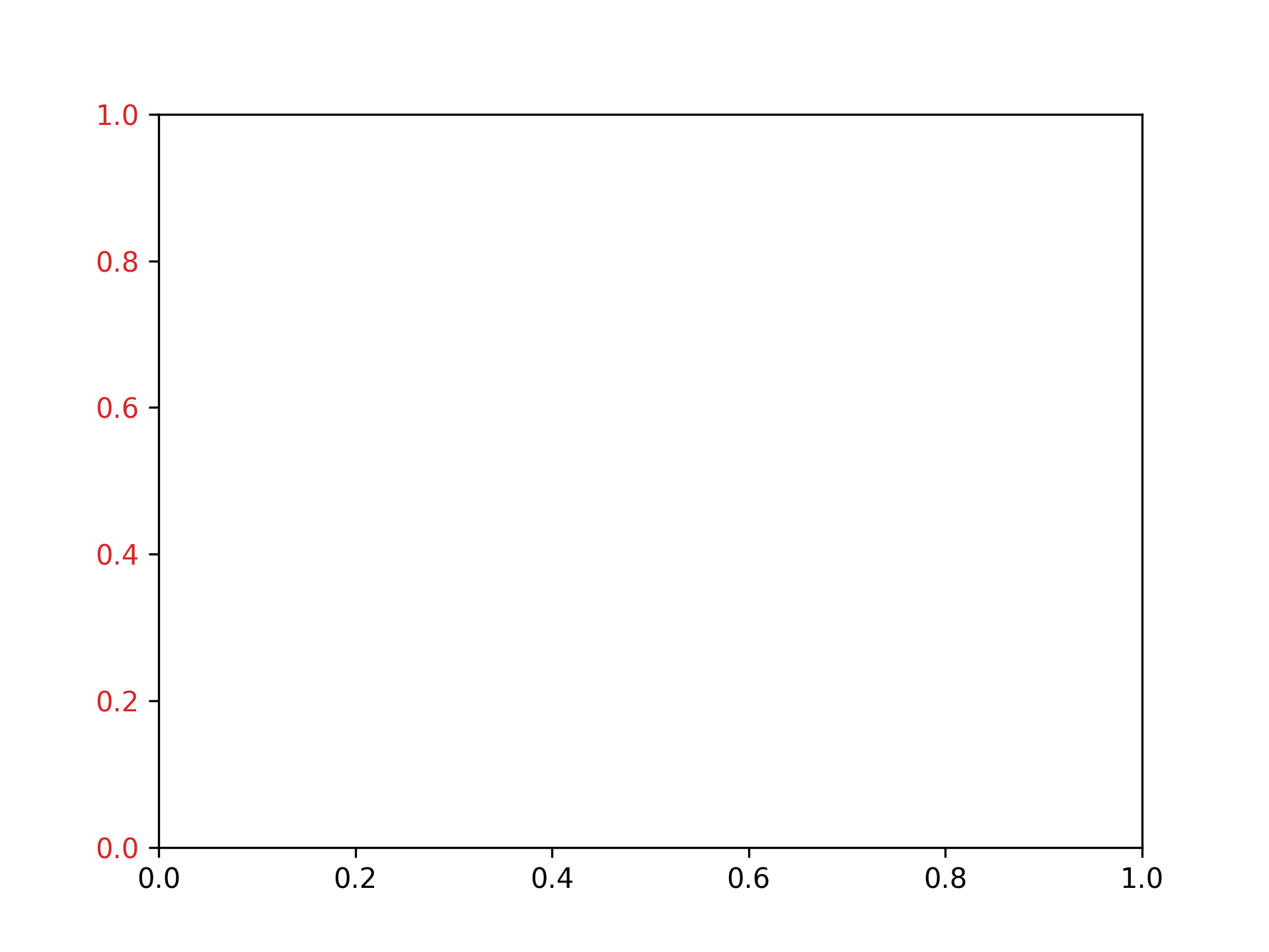
Setting y-axis tick label color to red
fig, ax = plt.subplots()
ax.tick_params(axis="y", labelcolor="tab:red")
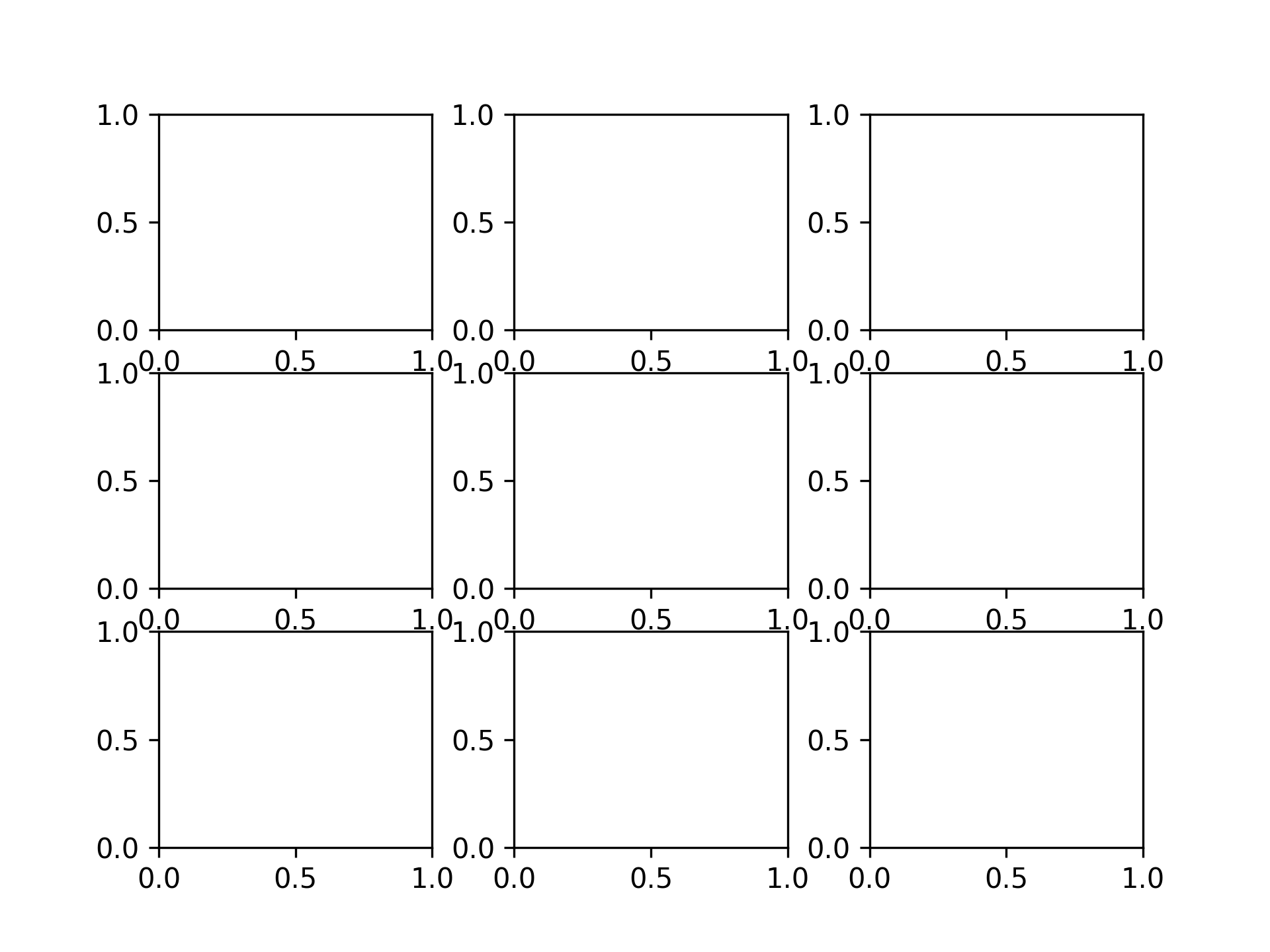
Adjusting Graph Spacing
Setting vertical spacing to 0.2 and horizontal spacing to 0.3
fig, ax = plt.subplots(3, 3)
fig.subplots_adjust(hspace=0.2, wspace=0.3)
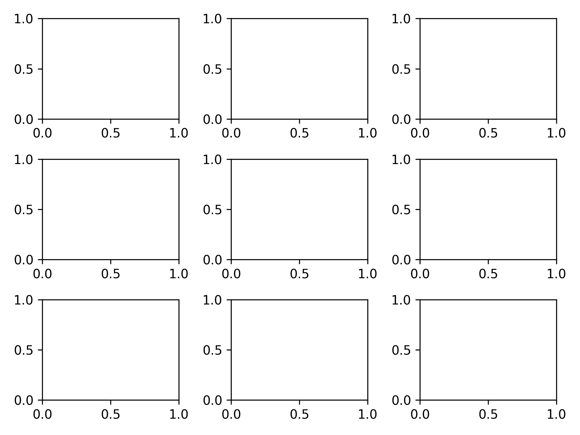
Setting spacing to automatic
fig, ax = plt.subplots(3, 3)
fig.tight_layout()
Saving Images
Saving as PNG
fig, ax = plt.subplots()
plt.savefig("graph.png")

Saving as SVG
fig, ax = plt.subplots()
plt.savefig("graph.svg")

Saving as PDF
fig, ax = plt.subplots()
plt.savefig("graph.pdf")
Saving at 300 dpi
fig, ax = plt.subplots()
plt.savefig("graph300.png", dpi=300)

Loading...